Contact US
Articles Tagged with

User Experience (UX)

EmInfo webinar march 2020

Building Your Personal Brand On LinkedIn: The Top Staffing & Recruiting Questions Answered

About the Webinar

Back by popular demand, Parqa Founder and CEO Tony Sorensen will address the most frequently asked questions from staffing owners, managers and recruiters about building your brand on LinkedIn. Late last year, Tony gave a very similar presentation for the American Staffing Association, where more than 500 attended and a 94% satisfaction rate was received. Tony will address best practices in the following 3 areas:

  1. Credibility on LinkedIn: What can you do to stand out?
  2. Visibility: When you post great content, how do you ensure the most people possible see it?
  3. Metrics: How should companies, recruiters and managers track success on LinkedIn?

As part of this webinar, you will also receive two free downloadable guides to leveraging some of LinkedIn’s newest platform updates: Featured Content and LinkedIn Events. This is one event you don’t want to miss!

In Partnership With

Presenters:

Tony Sorensen

CEO & OWNER, PARQA

Tony Sorensen is the founding visionary of Parqa. As a 20-year veteran and thought leader in the consulting and executive search industries, Tony is responsible for all aspects of the business. He is passionate about building winning teams, growing staffing and recruiting companies through digital marketing, strategic partnership development, and philanthropy.

Tony is an industry expert on a national level. As an authority in staffing and recruiting, Tony loves to travel the country speaking at conferences such as NAPS National Conference, ASA (American Staffing Association), NYSA (New York Staffing Association), TechServe Alliance, and more.

REGISTER FOR THE WEBINAR

person running in background

PDF Content Instead of HTML? Just Say No.

Beginning in the 90’s the PDF file type began its rise. When it was created, its purpose was to create a paperless office. A document that could be sent via email, read on any machine and printed locally if needed. While it fulfills that purpose well, it has been overused on various websites. 

Despite its roots and advantages, it’s time to move away from the PDF where digital content is concerned. PDF files have many limitations, both to users and to content creators. The time has come to fully embrace HTML for your digital content, and free yourself from the limits of PDF. 


Related Post: Content Marketing: Your 3-Step Recipe for Lead Generation ➢


A Nightmare for Users 

The first limit of PDFs is usability. Although it was meant to be universally readable that is not the case. For many users who don’t have a dedicated PDF reader installed, they won’t be able to open your content. In addition, PDF’s aren’t optimized for mobile users, which further complicates things for the many users browsing via their phones.  

For users with disabilities, PDFs are restrictive. They are not ADA compliant which in addition to reducing the usability of your website, makes a PDF hard to access for visually impaired users. 

Because of the file format, PDFs are also hard to share. Many sharing options only work on other file types such as .docs and .jpg which means users cannot spread your content organically via PDF. In addition, many business firewalls don’t allow PDF downloads, further blocking your content from its audience. Even if you only consider your users, PDF is not a great option for content format. 

A Headache for You 

On the content creation and marketing side, PDFs have even more challenges. First, PDFs aren’t crawlable by search engines. Your hard work on your content won’t be able to affect your SEO rankings and means you cannot track the performance of your content. 

If you take advantage of email marketing, PDFs are usually not used as attachments in those emails, due to download restrictions and security. During the development process, PDFs are also a headache to design from the start. When they are finished, making updates is slow and requires a new file upload every time a change is made. 


Related Post: Rank on Google and Bank with Content Marketing ➢


The Move to HTML 

If the downsides of PDFs weren’t enough to convince you, let’s look at the advantages of working with HTML.  

First and foremost, your content lives on your website. It is crawlable, shareable, and usable there. You get the benefits of SEO referred traffic. Other metrics can also be pulled from HTML content allowing you to measure reader behavior and nurture leads.  

If you’ve built your website to play nice with mobile users, HTML content that lives on your site is automatically mobile optimized. In addition, there is no need for version control or new uploads as the content can be edited at any time. 

Lastly, you can customize your content much more in HTML adding dynamic content such as videos or animated gifs. HTML content also allows you to link readers to other parts of your site via embedded CTAs. 

I’m not saying that the PDF doesn’t have a purpose. What I’d like to convince you of is that PDF isn’t the right format for your digital marketing content. HTML offers the flexibility and features that you need for successful marketing efforts. 

Parqa’s team of experts can help you make sure your site is optimized across the board. Schedule a call with us today to see what we can do to kick-start your digital brand. 

phone closeup

9 Stats That Prove the Importance of Website Design

It’s almost 2019 – hopefully you realized that your website, content, and overall design has a profound impact on the perceived credibility and quality of your business.

But just how much does your website’s design, layout, and content really impact your visitors’ experience and their likelihood of purchasing your product/ service?

THE ANSWER: a lot more than you might expect

Why the Design of Your Website is So Important?

Below are 9 stats that prove the importance of having a website that’s easily maneuverable, well designed and laid out, has quality content, etc.

“38% of people will stop engaging with a website if the content or layout is unattractive” 
– (Source: Adobe)

It takes 0.05 seconds for visitors/users to form an opinion about your website and determine whether they’re going to stay or leave. So your website’s content and layout has to entice your visitors enough to want to stay on the site and read/ learn more about your products and services.

“88% of online visitors/ consumers are less likely to return to a site after a bad experience.” 
– (Source: The Gomez report, Why Web Performance Matters)

This means that your website has to not only create a great first impression by being easy to read, easy to navigate and appealing aesthetically, it also has to entice visitors to stay on your site by almost immediately answering their questions.

“Judgements on a company’s credibility are 75% based on the company’s website design.”
– (Source: Web Credibility Research from Stanford)

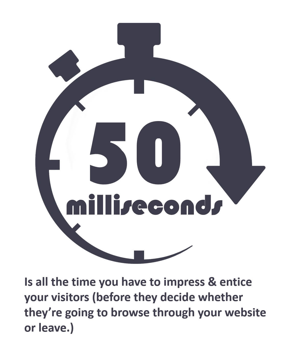
It’s almost 2019, and your website serves as a window into your company, thus it needs to exude trust and credibility. Otherwise you run the high risk of handing your potential customers over to your competitors with better designed websites.

Most often this trust is emphasized on the ‘about us’ page of the company’s website… See Parqa’s ‘About Us’ page

“Users spend an average of 5.59 seconds looking at a website’s written content”
– (Source: Eye-tracking study by Missouri University of S&T)

This is not a lot of time to soak in all the written content on your websites homepage.

The key to this is to utilize a concept called “progressive disclosure,” where people aren’t bombarded with content they don’t need right away, but they are still easily able to find it and other information by digging deeper into the website. (i.e. in the main navigation menu)[/vc_column_text]

“70% of small business websites lack a Call to Action (CTA) on their homepage and across their website.”
– (Source: GO-Gulf web development)

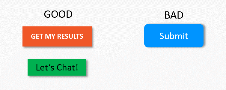
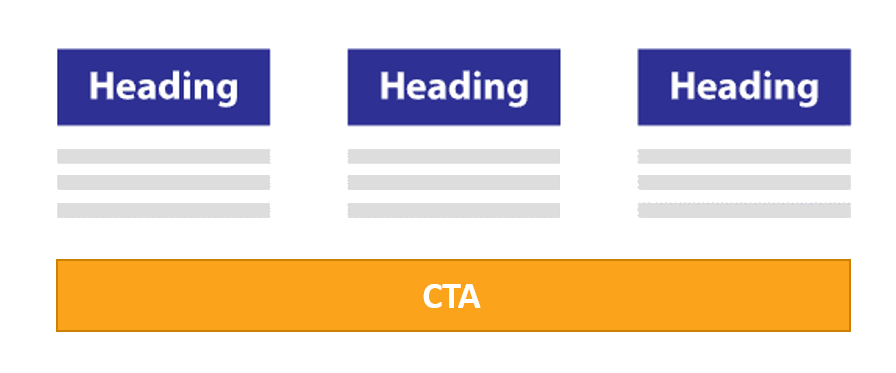
A great CTA button can direct users, get them to take a desired action, improve conversion rates, and ultimately help your website achieve its defined objectives.

How are visitors/ potential customers supposed to know what actions you want them to take if you don’t give them CTAs that help them better find what their looking for, or how to find more information?

…. They don’t and they can’t.


Related Post: Mobile Friendly vs. Mobile Optimization: What’s the Difference? ➢


“A study found that, first impressions are 94% design-related.”
– (Source: The Effect of Aesthetics on Web Credibility, Farah Alsudani & Matthew Casey)

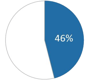
“That same study found that 46% of consumers base their decisions on the credibility of a website from its visual appeal & aesthetics.”
– (Source: The Real Business of Web Design, John Waters)


User Experience also plays a role in the effectiveness of your website: Learn More ➢


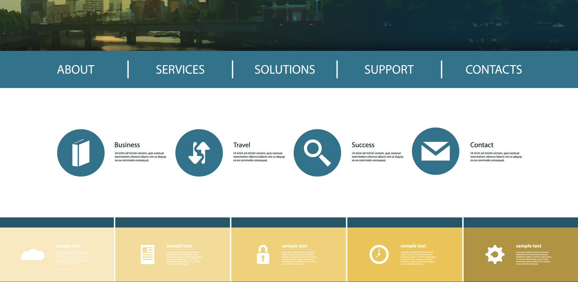
“47% of website visitors check out a company’s products/services page before looking at any other sections of the site.”
– (Source: KoMarketing)

“44% of website visitors will leave a company’s website if there’s no contact information or phone number.”
– (Source: KoMarketing)

I can’t tell you how many times clients come to me asking to look at their website and give them feedback, and they have no dedicated contact form page, no phone number and/or email address prominently displayed and easily visible/ clickable on their website. And they wonder why people don’t contact them through their website or why their website doesn’t generate leads.

The more time, energy, and money you put into your website, and better understanding the types of visitors that are coming to your site, the harder your website will work for you to generate leads/ purchases.

So, What Does All this Mean?

Your website is a magnet for judgement—and this judgement isn’t limited to the website itself—it carries over into the way users perceive the company as a whole.

All of these stats build on one another, any snag a user/ visitor hits on your website – whether it’s related to design, loading time, content or navigation—can be detrimental to your chances of turning that visitor into a lead/ customer.

“A bad website can greatly tarnish a company’s credibility—but a quality website can help a company extend its sphere of influence and create leads.” – Sweor

The difference between obtaining a lead and losing a lead may be as simple as making small adjustments that change the way users perceive your website the first time they interact with it.

“88% of online visitors/ consumers are less likely to return to a site after a bad experience.”

Source(s):
https://www.sweor.com/firstimpressions
https://blog.hubspot.com/marketing/compelling-stats-website-design-optimization-list
https://econsultancy.com/site-speed-case-studies-tips-and-tools-for-improving-your-conversion-rate/

The Truth About B2B Web Design and Why You Should Invest in It


https://web.archive.org/web/20130209052518/http:/scholarsmine.mst.edu:80/thesis/Eyes_dont_lie_unde_09007dcc80993a1e.html
https://www.bcs.org/upload/pdf/ewic_hci09_paper66.pdf
http://www.komarketingassociates.com/files/b2b-web-usability-report-2015.pdf
https://books.google.com/books?id=8Ij4DAAAQBAJ

woman taking notes from computer

Your Website’s User Experience: Why It’s Important

User Experience: also known as UX is defined as the overall experience you have when you are using or interacting with something.  Most often we think and talk about this in terms of ‘technical’ devices like smartphones, but the truth is UX is much broader.

In this article we’ll be referring to UX as the experience your visitors have when browsing through and interacting with your website.


“If you can get visitors to stay on your site for 30+ seconds, there’s a good chance they’ll stay much longer on your website — often times 2+ minutes.”

Why Should I Care About My Website’s UX?

plays a critically important role in getting potential customers to spend time on your website, interact with your site and/or complete a specific action on the site (i.e. e-book download, contact form submission, purchase, phone call, quote request, etc). Without a good website UX you’re basically handing your potential customers over to the competition.

You have about 10 seconds to convince a web-visitor to stay on your website.

Even if they decide to stay, they’re still highly likely to leave within the subsequent 20 seconds of their visit.  So your website has to draw them, the content has to get them reading or scrolling through the page, while your CTA’s and other call-outs entice them to want to dig deeper into your site (whether it’s looking at more of your products, services, or learning more about your company).

“If people perceive the opportunity to interact and are confident that the interaction will help them reach their goal, then the probability of interaction is very high, and we will observe focused and intentional interaction.”

How Do I Know if My Website Has a Good UX?

There are a number of ways to tell if your website has a good UX. Below is a compiled list of some of the top UX requirements you should have on your website, why they’re important, and what you can do to improve your website’s UX and increase conversions.

The more ‘yeses’ you can answer on the statements below the better User Experience your site has.

Related Post: Redesigning Your Website? Why You Need to Work with an SEO Firm ➢


  • Your contact form button(s) doesn’t say “submit”
  • All of your web pages have breadcrumbs on them
  • You change the content on your homepage frequently to keep it fresh for returning visitors
  • Your blogs/ news articles are written using the inverted pyramid style format
  • (For service/ B2B based businesses): You have a pricing page or information about your pricing somewhere on the website
  • You have an ‘About Us’ page
  • Your website provides anticipatory feedback somewhere(typically on product category or blog/ news pages)
  • The majority of your site content is laid out/written using short paragraphs and bullet points
  • You don’t use any/ many stock photos throughout your website

A form button that says ‘Submit’ gives users the impression that the form isn’t focused on a specific task.  It also gives off the impression that your website isn’t user-friendly because you’re speaking in a technical way most users aren’t familiar with. If this is the impression they get when they fill out your form, you can bet you’re going to lose a few users.

Use text that is task specific and describes what the person can expect to happen after they click the button, (i.e. “Get Your Results, “Create Account”, “Subscribe Now”, “Register”, etc.)BREADCRUMBS: are little navigational aids that help people visualize where they are on your site, and also help Google determine how your site is structured.

EXAMPLE:
Electronics > Computers & Accessories > Computer Cases


Advantages to using breadcrumbs:

  1. Visitors take fewer steps when navigating from section to section – enhancing user experience (UX)
  2. They clarify site navigation that shows visitors where they are on a site’s hierarchy of pages
  3. Google loves them because it helps it make hierarchical sense of your website structure
  4. They lower bounce rates

Changing content frequently on your homepage is a way to keep it fresh for returning visitors.

The inverted pyramid style:

  • Start with the conclusion
  • Explain the most important facts
  • Write in small chunks
  • Give each new idea its own paragraph
  • Give more background detail after the important facts

Even if you give the whole story away in the first sentence, your visitors are likely to continue reading, because they’re after information and they’re going to continue reading/ skimming the blog/article until they get to the level of detail they want.

(For service/ B2B based businesses)

The lack of pricing on B2B websites is one of the biggest frustrations for potential customers and is likely going to play a role in your business losing a sale.  Studies show that pricing information is 2x as important to B2B purchasers as a contact phone number.

You may have many reasons why you can’t/ don’t want to show pricing information on your site, but regardless of what the reason is, there is a way to provide customers information on your pricing (whether or not that includes actual $$$ values).

Your pricing page/structure should show one of the following:

  • Let visitors use a cost calculator on your site to calculate some sort of hypothetical cost
  • Give examples of work you’ve done and the price for which that client paid
  • Why you can’t provide a pricing structure online?, be specific as to why

If you have an ‘about us’ page, does your content answer “yes” to the following questions?

Does it provide info that helps them understand/ determine if you a good match for their needs?

Does it evoke a sense of trust?


This is one of the most underrated pages on most websites. All too often organizations/ businesses see this simply as a page they must have on the website because everyone else does, but it’s almost never optimized or changed.

The ‘About Us’ page might as well be called the “Can I Trust You Page?”  Visitors/ potential customers need a way of knowing more about you so they can be sure you’re okay to do with business with, or that the information you’re providing is accurate.  They also need to be able to determine if you’re a good match for their needs.

What you should include on your ‘about us’ page:

  • company history (i.e. how long have you been in business?, what’s the story behind the business?)
  • who are some of your clients/customers or typical types of businesses you work with
  • testimonials
  • information about/ links to your service or product offerings

[ANTICIPATORY FEEDBACK: is information provided before a person interacts to help them understand what the outcomes may be.


Visitors/ customers are already overly impatient when it comes to browsing the web, so incorporating anticipatory feedback/ design into your web-pages is crucial. Whether they’re booking a trip or buying a board game for the family game night, the priority is not so much freedom of choice as it is efficiency in arriving at the desired end.

(This helps people avoid interactions and choices that are not going to help them achieve their goals,) and move them quickly and easily navigate through the desired pathway to their destination as quickly as possible.

More is not better when it comes to websites, in fact it’s almost the exact opposite.  As mentioned above your site content and structure should be in a way that answers your visitor’s most important questions, but it should do it in a way that is simple and easy to find and understand.

By focusing your visitor’s attention on what’s important and making it easier to understand means customers are less likely to go to a competitor for the same service.

Tips to help focus your visitor’s attention on important information:

  • use bullet points when possible, as they are easier to scan and read over
  • keep pages clean and simple (don’t overload them with sidebars, forms, etc.)
  • have service pages that describe in detail the different services your company offers

Your visitors should feel like the site is specifically tailored directly to them and not an overall general user type.

(Answer Honestly) Do you utilize stock photos on your site?


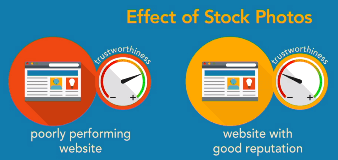
It’s okay to utilize some stock photos, as long as they don’t scream “stock photo”

However, studies have found that although the perceived trustworthiness of poorly performing vendors was increased when they used stock photography, perceived trustworthiness of vendors with good reputations was decreased.

If you have the ability to utilize customized photos of your actual office and employees, do so.

coworkers together on redesigning website plan

Redesigning Your Website? Why You Need to Work with an SEO Firm

Why Do I Need an SEO Firm?

When redesigning your website, it is vital to take SEO into consideration. If your website isn’t easy for Google to crawl, doesn’t provide a simple UX, and portray trust to your customers, no amount of keyword optimization or SEO magic is going to help you improve search engine rankings, grow your online presence or increase online leads/ revenue.

To ensure your new site will resonate with your targeted audience — and to save yourself from costly headaches down the road — SEO needs to be integrated into your website redesign strategy from the beginning.

SEO is not just about optimizing page titles and on-page content, it’s about all the factors that help you improve your search-engine rankings and online presence, and YOUR WEBSITE EXPERIENCE is #1.

You can partner with a website design/development agency, but without an experienced SEO company/specialist you’re going to have to make significant changes after your new website has been created.

What is SEO?

SEO is anything that impacts potential links, any input that engines use to rank pages. Anything that people or technology does to influence those ranking elements is what the practice of SEO is about.

– Rand Fishkin, Moz


Related Post: How Long Does it Take for SEO to Produce Results? ➢


Your Website Redesign & SEO

While you may want to try and save money by pausing your retainer with your SEO partner during your website redesign, you’re likely going to end up paying more in the long run because of the significant changes that will probably need to be made from a website UX perspective. Changes include: adding CTA’s, URL/folder structure, keyword optimized URLs, H1 vs H2 title tags, internal linking, content that builds trust with readers, etc.)

Myself, along with other digital marketing and SEO experts can’t emphasize enough the importance of incorporating SEO into the redesign of your website:

“If you don’t have SEO in mind from the initial strategy session, you’re going to lose what you took so much time and effort to build. Everything from the structure of your website to the meta description of your website pages is important and should be taken into consideration.”

-Laura Hogan, OverGo Studio

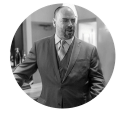
“All too often, when we’re brought in for SEO work on a redesign, it’s often late in the process, such as when the site is being coded or even totally complete. The advice that usually needs to be passed on at this point will most likely cost the company much more in design, coding, and more.”

-Jeff Ferguson, Fang Digital Marketing

Like many small-to-mid-sized business owners, you might wonder why your digital marketing firm is talking about your website’s UX. The overall design experience of your website, as well as its mobile friendliness, is a ranking factor for Google. Plus, in order for SEO and PPC to be effective in helping you grow your business and generate leads, your website has to provide a great UX to visitors and establish trust.


Related Post: Mobile Optimization vs. Mobile Friendly: What’s the Difference? ➢


 “SEO is neuropsychology. SEO is conversion rate optimization. SEO is social media. SEO is user experience and design. SEO is branding. SEO is analytics. SEO is product. SEO is advertising. SEO is public relations. The fill-in-the-blank is SEO if that blank is anything that affects any input directly or indirectly.”

 -Rand Fishkin, MOZ


Related Post: What is SEO? – Beyond the Keywords ➢


Isn’t My Website Good Enough?

‘Good Enough’ won’t cut it when it comes to your website’s UX

A few reasons why having a good UX matters:

  • A poorly designed website can impact the trust users have in your business.
  • A poorly designed website can deter visitors from buying your products or services.
  • A poorly designed website can impact if users will share your content.

Conclusion

If you choose to hire a web-design company or freelance designer for your small to mid-sized business, you should be sure to also choose an individual or SEO firm to partner with during the redesign process. They will help ensure SEO best practices will be properly integrated into your new website from the beginning. This will save you time, and money, down the road.

"*" indicates required fields

This field is for validation purposes and should be left unchanged.

Privacy Settings
We use cookies to enhance your experience while using our website. If you are using our Services via a browser you can restrict, block or remove cookies through your web browser settings. We also use content and scripts from third parties that may use tracking technologies. You can selectively provide your consent below to allow such third party embeds. For complete information about the cookies we use, data we collect and how we process them, please check our Privacy Policy
Youtube
Consent to display content from - Youtube
Vimeo
Consent to display content from - Vimeo
Google Maps
Consent to display content from - Google
Spotify
Consent to display content from - Spotify
Sound Cloud
Consent to display content from - Sound
Contact Us