
All mobile–optimized websites are mobile–friendly, but not all mobile–friendly websites are mobile–optimized.
The reality is: We have all been inundated with reasons and stats about why a mobile website is so important for the continued success of businesses. However, with all that information comes a lot of mobile-related terminology. But what does all that terminology mean and how does it impact your website? Terms such as mobile-ready, mobile-responsive, mobile-friendly, mobile-first, mobile-optimized, and more! Let’s take a look at each term one at a time.
Related Post: Understanding Your Company’s Digital Needs: Is It UX or Digital Marketing? ➢
Mobile-Friendly vs. Mobile Optimized
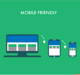 Mobile Friendly – Mobile-friendly is the bare minimum mobile design strategy you should have to engage your mobile visitors. While mobile-friendly websites will work for mobile users, these websites were designed for desktop users and are typically slimmed-down format of the desktop version.
A smaller version of your desktop website may fit in a smartphone screen and can be functional, but it’s not designed to maximize user experience, improve your rankings on Google, or convert mobile traffic into leads or purchases.
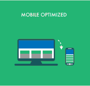 Mobile Optimized – A mobile-optimized website is designed and built using a mobile-first approach and will reformat itself for mobile users.
Mobile users navigate, read, and act differently on your website than users viewing the desktop version. So why wouldn’t you provide them with a different and mobile-optimized version of the site?
The goal of a mobile-optimized website is to make the website as frictionless as possible for the mobile user.
Mobile users are seeking the quickest, most efficient way to answer their questions. (i.e. do you sell x product? how much does it cost? Do you offer y service? Where are you located? Etc.)
Why do I need a Mobile Optimized Site?
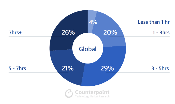
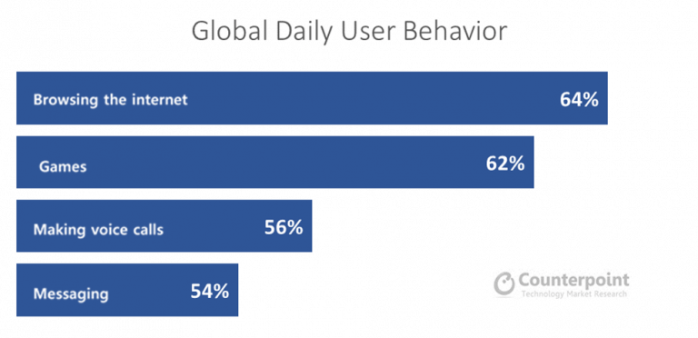
The stats: Almost half of U.S. smartphone users are spending 5 hours per day on mobile devices, according to new data released by analytics firm Flurry. And “browsing the internet is amongst the most popular activities on smartphones”, according to Counterpoint a Technology Market Research Firm.
The frequency of mobile usage emphasizes the importance of mobile websites for businesses. For any business to be successful in today’s online (and predominately mobile) market, it’s vital to have a website that responds effortlessly on mobile devices and provides a seamless user experience.
 It’s all about Google: Last October (2017), Google started rolling out its mobile-first index. This update means that Google will serve users different results on mobile than it does on desktop for the exact same search. Additionally, the update factors how a website performs on mobile devices before determining a websites placement within the search results.
In a nutshell, for businesses/organizations to continue prospering in the digital age, and for them to show up in search results, they need to have websites that maximize the mobile experience for users. Thus, building a website with a mobile-first approach is becoming more and more vital.
What can I do to Optimize my site for Mobile?
Design features of a mobile-optimized website can include:
- Single column layout
- Easy, simple navigation (that is “thumb” friendly with large touchpoints) especially for critical contact information
- Reduced graphics that don’t interrupt the quest for critical information
- Formatted content for maximum readability
- Fewer number of features overall (minimalist, uncluttered design) (i.e. CTAs)
What about my Small Businesses Mobile Website?
As a small – mid-sized business should my company/ organization discuss a mobile optimized version of our website? Will investing in a mobile optimized website bring a measurable return?
These are excellent questions only you, or someone with access to your Google Analytics can provide. What percentage of your site visitors are on mobile devices? This should be one of the first things you look at, and can give you unparalleled insight as to whether or not you need a mobile optimized site.
If you’d like to learn more about your websites current performance and how you can improve the performance/ traffic coming to your site…feel free to reach out to us online!
Free Mobile Optimization Tools
To see how the mobile version of your website performs or to get ideas of how you can improve the performance of your mobile site, check out one of the FREE mobile website optimization tools below.
- Mobile-Friendly Test: https://search.google.com/test/mobile-friendly
- Website Test: https://testmysite.withgoogle.com
- Make the Web Faster: https://developers.google.com/speed
- AMP Pages: https://search.google.com/test/amp
- Mobile Optimization Guide: https://varvy.com/mobile


